Tomorrow, Google Code-in will end. I spent nearly all of my month by participating to it and it has been one of my great experiences. Thanks to the contest, I’ve learnt a lot of things, met with people from different projects and communities and became a KDE developer.
At the moment, I have completed 21 tasks and 20 of them is Marble’s, my favorite virtual globe. I have created two online service plugins, a map creation wizard and DGML tag writers for it. And in case you wonder, my other task was a Plasma task, I’ve created three activity templates and improved an existing one.
The online service plugins which I have created are earthquake and OpenDesktop community plugins. Earthquake plugin shows recent earthquakes and their magnitudes on the globe. Each magnitude range is shown in different colors.
And OpenDesktop Community plugin shows OpenDesktop community members’ avatars on the map.
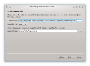
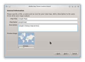
The wizard which I mentioned helps users to create new maps easily. It can create three kinds of maps,
- Static image map (a bitmap of whole world)
- Static URL map (maps like OpenStreetMap and Google Maps)
- WMS maps (maps of Web Map Service providers)
Being part of Marble community was a great adventure for me; getting help from people when I stuck, showing off my work, commiting my code to KDE’s SVN repositories and more.
If you want to get involved and contribute, visit Marble’s webpage. You can get involved with coding, documentation, artwork and promotion of Marble.

Special thanks to Torsten Rahn, Dennis Nienhüser, Thibaut Gridel and Bernhard Beschow I couldn’t do anything without your help.


You’re awesome!
Thanks! 🙂
Good job!
Do you have any idea how I can buy some marble T-Shirt? :))
I don’t think they are on sale, you should ask Torsten. 🙂
Amazing work! Thank you for your valuable contributions!
Hi,
First of all congrats on a job well done! Google Code In is such a very short time, glad to see so much done in it.
Suggestion for improvement: Displaying earthquake magnitude using a linear magnitude, while widespread, is rather misleading. The true nature of the energy is much more than the often assumed 1o^x as well, it’s something greater than 10^(x+11).
http://earthquake.usgs.gov/learn/topics/measure.php
Energy_petajoules = ( 10^(11.8 + 1.5*Ms) ) * 1e-07 * 1e-15
IEEE floating point numbers can’t really keep up with how big those numbers get, you have to store energy as log(). And computer monitors deficiently can’t keep up with it. It is truly staggering how much energy these things release.
But back to visualization: if you want to keep magnitude 9s on screen, and keep true to some sort of realistic scaling, some compromises have to be made which skew the curve to artificially favour the magnitude 4-6s which are relevant to the human experience.
The best qualitative computer screen compromise I’ve come up with for this after a small time of experimentation is to use (magnitude^10)*1e-7, then linear scale that x3, and set the ring line width (or alpha opacity) to x0.2.
a prototype of these ideas generated by GRASS GIS can be seen here:


(the tutorial code for that is available GPL, so may not be used in Marble, but the ideas are Free and simple enough to implement)
another idea is to scale everything based on the largest quake you’ve got, with the biggest being x% of the image size. I expect the frequency distribution of magnitudes are somewhat stable. That way your 4s are not always tiny pinpricks just because you have to leave room because sometimes a e.g. 8.8 happens in Chile.
Also using a solid disc masks all the aftershocks, so a semi-transparent bubble (or failing that a hollow ring) can get more data across. Of course you’d have to check for overlapping number labels, and prioritize for the biggest number, but I guess you’re already doing that.
good stuff! hope you apply for the Google Summer of Code next year.
Hamish
Hi Hamish,
Great input!
Of course with the “truely energetic” visualization it becomes a harder to get the big earthquakes displayed in a reasonable way alongside with small earthquakes (so that they are still visible and don’t vanish in a single pixel. Of course this problem: Star brightnesses properly reflected on a starchart or depicting the whole solar system with all the planets has a similar issue. So often enough the visualization tries to make a good compromise between beauty, usability and being “realistic”. So maybe we should have visualization that gets across the non-linear nature of the earthquake magnitudes but still leaves the smaller earthquakes easy to see and easy to judge in comparison.
The linearness of the magnitude had bugged me a bit right from the start but the earthquake plugin is still in an early state, so it’s something we can fix. I’m not a big fan of featuritis but maybe we can introduce a combobox in the earthquake configuration dialog which lets the user choose which representation he’d like to see:
* compromise
* energetic
Regarding the priorization: yes that is possible and even supported by the Online Plugin framework.
It would be cool if people who have more knowledge about earthquakes could get involved with the development of the plugin. Marble’s code quality is pretty good and creating visualizations like these is pretty easy to do. So there’s no reason not to get involved in coding 😉
In the above reply “Of course this problem:” is supposed to read “Of course this problem is not new:”